- US CPI inflation lands on the screws…
- ...with very little breadth in key services inflation...
- ...driving a dovish market reaction…
- ...while Fed officials continue to guide further hikes including 25bps next time
- The uncertain path forward keeps inflation risk slanted upward
- US CPI, m/m % SA // y/y %, December:
- Actual: -0.1 / 6.5
- Scotia: 0.0 / 6.5
- Consensus: -0.1 / 6.5
- Prior: 0.1 / 7.1
- US core CPI, m/m % SA // y/y %, December:
- Actual: 0.3 / 5.7
- Scotia: 0.4 / 5.8
- Consensus: 0.3 / 5.7
- Prior: 0.2 / 6.0
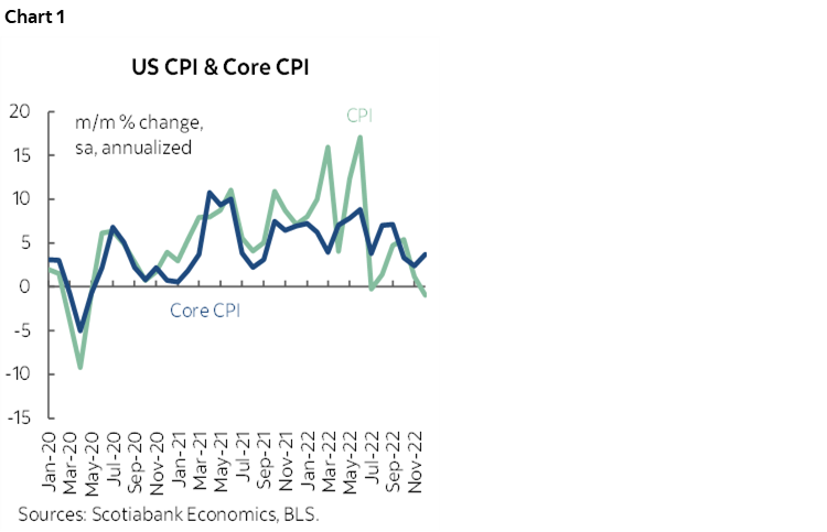
US CPI landed on the screws at -0.1% m/m SA for headline inflation and +0.3% m/m for core CPI which on both counts was just a tick beneath my estimates and further below nowcasts. The annualized m/m rate of change in core CPI accelerated to 3.7% from 2.4% in November which puts the three-month moving average at 3.1% (chart 1). That is cooler than earlier periods but still persistently too warm for the Fed’s liking and that may be what the Fed will emphasize especially as evidenced in Powell's speech in November and his communications in December. Breadth, however, was generally rather soft. Forward-looking risks probably remain more skewed toward upside than downside risk.
MARKET REACTION
Markets reacted favourably as the two-year Treasury yield fell by about 3–4bps post-data, fed funds futures shaved 3–4bps off of pricing for the February 1st meeting that is now basically pricing a 25bps hike and also reduced terminal rate pricing by just 1–2bps with still another 50+bps of tightening priced that would raise the fed funds upper limit to about 5% versus the FOMC’s 5.25% median estimate.
FED REACTION—STICKING TO THEIR GUNS
We’ve already heard from Philly’s Harker (voting) who said he leans toward downshifting to a 25bps pace and a terminal rate a little above 5%, so presumably he’s one of the 5¼% dots. Bullard said he still favours getting above 5% “as soon as possible.” and that there is too much optimism in markets that inflation will fall. Barkin next (12:40pmET, nonvoting).
HOW LOW CAN IT GO?
Where to from here for CPI? Chart 2 shows three scenarios for the year-over-year rate. The lowest scenario is derived by only allowing year-ago base effects to work through while keeping the CPI index level unchanged on a monthly basis over the next year; it shows how much of a deceleration would be driven by shifting year-ago comparisons. The next lowest line comes from combining this shift in year-ago base effects with average monthly seasonality in price pressures drawn from before the pandemic; it shows that inflation decelerates but bottoms at just under 2% y/y. The third line is our Scotia Economics forecast for CPI that expects it to end the year at 3.8% y/y (consensus 3%) by forecasting greater trend pressures than average seasonality would suggest.
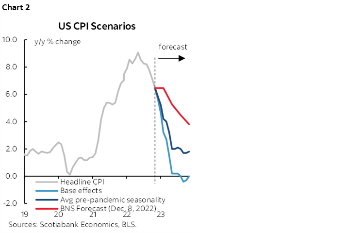
There is a lot of uncertainty around all CPI views going forward, but I still think Powell will see more upside risk than downside risk to inflation going forward given evolving developments. One is how tight the job market is and what that may mean to real wage pressures going forward and his connection to core service prices defined as within PCE (not CPI) and by stripping out shelter and energy. Two is that pandemic developments might exert renewed pressure on supply chains and upward risk to prices via China’s abrupt ending of Covid Zero policies and the XBB.1.5 variant in the US. Markets and some economists may therefore be more focused upon the latest inflation print than the Fed may be as it sticks to its tightening path and leaning against easing bets.
DETAILS—LACK OF BREADTH EITHER UP OR DOWN
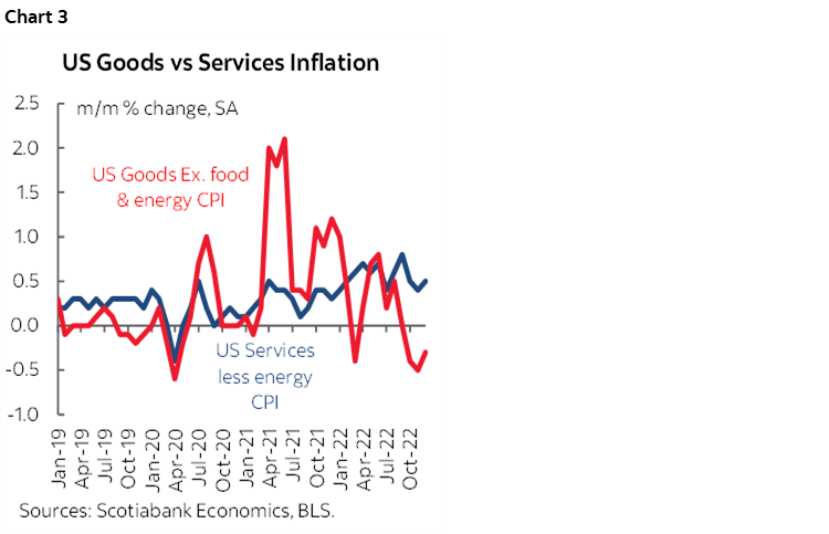
Core goods price inflation was a little less weak last month than the prior month, but prices still fell (chart 3). Core services (ex– energy services) inflation picked up a touch but was flat ex-shelter.
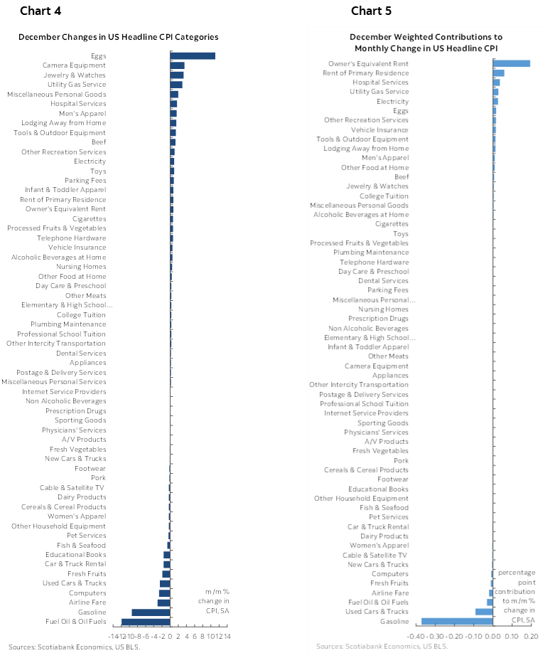
Charts 4 and 5 (next pages) illustrate unweighted m/m changes in CPI components and their weighted contributions to m/m CPI respectively. It was basically a matter of housing versus gasoline with a few other small effects that overall point to narrow breadth in weighted movements.
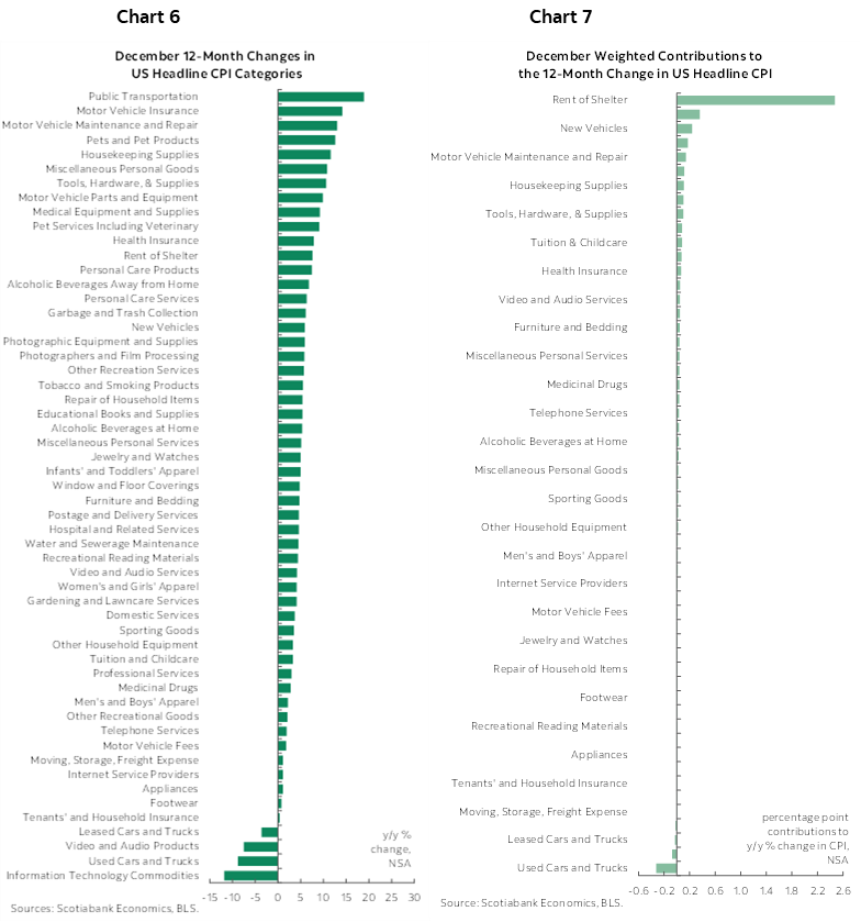
Charts 6 and 7 do the same thing for year-over-year rates of inflation by component.
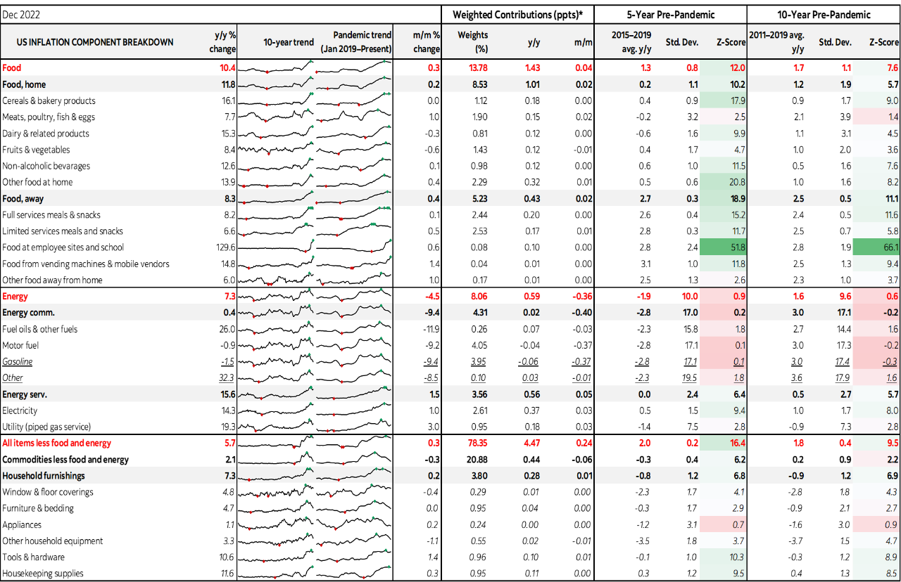
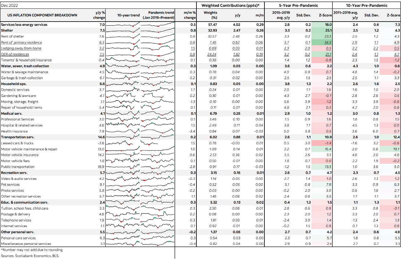
Among individual components, shelter was up 0.8 m/m with rent of primary residence at 0.8% and OER at 0.8%. There is so far zippo cooling evidence in terms of housing with all of that still ahead of us later in the year and gradually so (see the Global Week Ahead for how the lags work). Also recall that PCE attaches half the weight to shelter that CPI does.
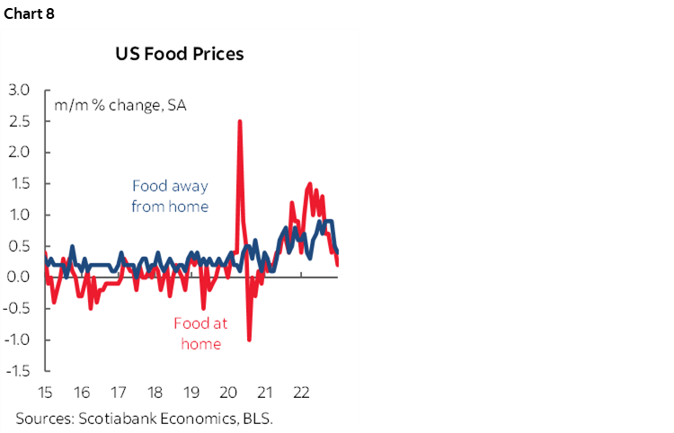
Food was up 0.3% led by 'away from home' as at home was up 0.2 Chart 8. Gasoline fell 9.4% and shaved 0.4 ppts off of headline CPI SA.
Medical care services were up 0.1 and ditto for medical care commodities.
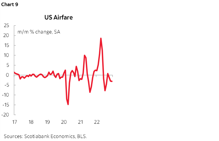
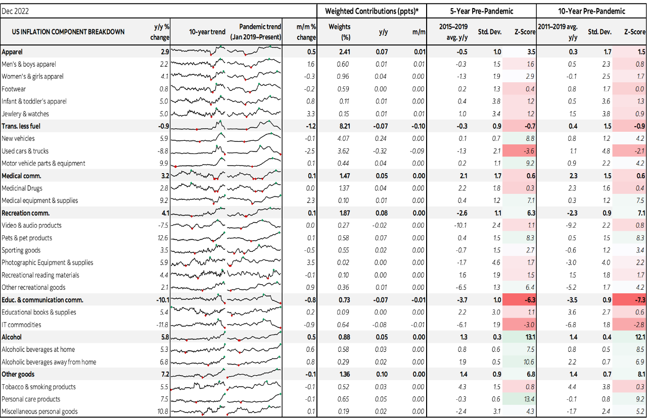
Airfare was down 3.1% m/m and has fallen in six of the past seven months (chart 9). Lodging was up by 1.5% m/m, car rentals fell by 1.6%.
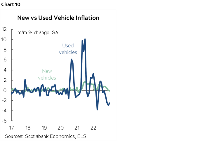
New and used vehicle prices had minimal effects in weighted terms (chart 10).
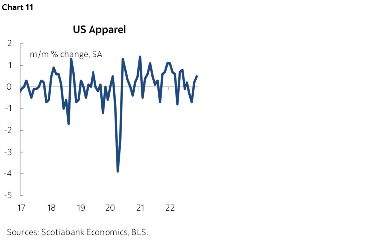
Apparel prices were up by 0.5% m/m SA which at a 2.4% weight meant nothing in terms of weighted contributions to CPI (chart 11).
Please also see the accompanying detailed table including micro-charts and z-scores of deviations from historical norms for price changes.
DISCLAIMER
This report has been prepared by Scotiabank Economics as a resource for the clients of Scotiabank. Opinions, estimates and projections contained herein are our own as of the date hereof and are subject to change without notice. The information and opinions contained herein have been compiled or arrived at from sources believed reliable but no representation or warranty, express or implied, is made as to their accuracy or completeness. Neither Scotiabank nor any of its officers, directors, partners, employees or affiliates accepts any liability whatsoever for any direct or consequential loss arising from any use of this report or its contents.
These reports are provided to you for informational purposes only. This report is not, and is not constructed as, an offer to sell or solicitation of any offer to buy any financial instrument, nor shall this report be construed as an opinion as to whether you should enter into any swap or trading strategy involving a swap or any other transaction. The information contained in this report is not intended to be, and does not constitute, a recommendation of a swap or trading strategy involving a swap within the meaning of U.S. Commodity Futures Trading Commission Regulation 23.434 and Appendix A thereto. This material is not intended to be individually tailored to your needs or characteristics and should not be viewed as a “call to action” or suggestion that you enter into a swap or trading strategy involving a swap or any other transaction. Scotiabank may engage in transactions in a manner inconsistent with the views discussed this report and may have positions, or be in the process of acquiring or disposing of positions, referred to in this report.
Scotiabank, its affiliates and any of their respective officers, directors and employees may from time to time take positions in currencies, act as managers, co-managers or underwriters of a public offering or act as principals or agents, deal in, own or act as market makers or advisors, brokers or commercial and/or investment bankers in relation to securities or related derivatives. As a result of these actions, Scotiabank may receive remuneration. All Scotiabank products and services are subject to the terms of applicable agreements and local regulations. Officers, directors and employees of Scotiabank and its affiliates may serve as directors of corporations.
Any securities discussed in this report may not be suitable for all investors. Scotiabank recommends that investors independently evaluate any issuer and security discussed in this report, and consult with any advisors they deem necessary prior to making any investment.
This report and all information, opinions and conclusions contained in it are protected by copyright. This information may not be reproduced without the prior express written consent of Scotiabank.
™ Trademark of The Bank of Nova Scotia. Used under license, where applicable.
Scotiabank, together with “Global Banking and Markets”, is a marketing name for the global corporate and investment banking and capital markets businesses of The Bank of Nova Scotia and certain of its affiliates in the countries where they operate, including; Scotiabank Europe plc; Scotiabank (Ireland) Designated Activity Company; Scotiabank Inverlat S.A., Institución de Banca Múltiple, Grupo Financiero Scotiabank Inverlat, Scotia Inverlat Casa de Bolsa, S.A. de C.V., Grupo Financiero Scotiabank Inverlat, Scotia Inverlat Derivados S.A. de C.V. – all members of the Scotiabank group and authorized users of the Scotiabank mark. The Bank of Nova Scotia is incorporated in Canada with limited liability and is authorised and regulated by the Office of the Superintendent of Financial Institutions Canada. The Bank of Nova Scotia is authorized by the UK Prudential Regulation Authority and is subject to regulation by the UK Financial Conduct Authority and limited regulation by the UK Prudential Regulation Authority. Details about the extent of The Bank of Nova Scotia's regulation by the UK Prudential Regulation Authority are available from us on request. Scotiabank Europe plc is authorized by the UK Prudential Regulation Authority and regulated by the UK Financial Conduct Authority and the UK Prudential Regulation Authority.
Scotiabank Inverlat, S.A., Scotia Inverlat Casa de Bolsa, S.A. de C.V, Grupo Financiero Scotiabank Inverlat, and Scotia Inverlat Derivados, S.A. de C.V., are each authorized and regulated by the Mexican financial authorities.
Not all products and services are offered in all jurisdictions. Services described are available in jurisdictions where permitted by law.