March 30 marks Scotiabank’s 190th anniversary. It first opened its doors in 1832 in Halifax, at the corner of Granville and Duke Streets. Now, 190 years later, Scotiabank is a Leading Bank in the Americas and serving customers across the globe.
With its bright vibrant red, Scotiabank’s distinctive logo can be spotted outside every branch across the country. However, the Bank’s logo wasn’t always bright red. It wasn’t until 1974 that Scotiabank adopted the shade it now calls Scotia red. The ways the Bank used its logos and how they were adapted through the years have also changed.
Take a closer look at how Scotiabank’s brand identity has evolved over the last 190 years:
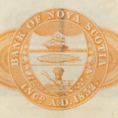
1832
Since the Bank’s early days, a seal has been used as a corporate identifier. The central shield contains a sailing vessel, a codfish, and a plow with a sheaf of grain, icons that represent Canada and some of the large industries the country’s early wealth came from.
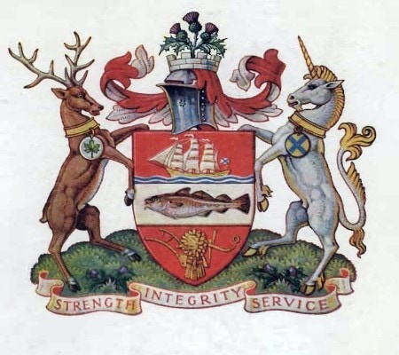
1921
The 1832 logo begins to transform. A. Scott Carter was hired to formalize the design of the seal, while doing so he also designed the coat of arms. Carter was a member of the Royal Architect Institute of Canada and was an internationally acclaimed heraldic artist. Using the seal design, he added a stag and maple leaf, to represent Canada. The Thistle, unicorn and St. Andrew’s cross represent the Scottish tradition of Nova Scotia. St. Andrew's cross, which is represented on the Scottish flag, is an X. It's worn by the unicorn, the national animal of Scotland. The thistle is the national plant. Finally, at the bottom it reads Strength, Integrity, Service, the Bank’s motto. The coat of arms was approved by the Scotiabank Board in 1950 and in 1951, by the College of Arms in London, England. As a Commonwealth nation, the College of Arms in London was the body responsible for approving and authorizing the use of the coat of arms in Canada at the time.

1951
In 1951, our new office opened its doors in Toronto at 44 King St. West. The new logo incorporates the look of the new “General Office,” as it was referred to at that time. This logo was used in both publications and letterhead.

1961
This is the first usage of the Scotiabank wordmark. The design was initially introduced as dual-font. This represented Scotiabank’s two sides – the secure and stable bank with a long tradition and the youthful, contemporary-minded institution. The font used for “Scotia” was reflective of the 18th century style known as Spencerian script. A brand-new font, created just for Scotiabank, was used for “bank”. The font was based on magnetic ink figures for mechanized cheques, which were rapidly becoming standard at the time.

1963
Scotiabank wanted to emphasize its reputation as an international bank, adapting the “globe and arrow” logo. The adapted logo was often presented in conjunction with the dual-font wordmark from 1961.

1974
Scotiabank introduced the “Flying S” logo, along with what the Bank refers to as Scotia red. The warm shade of red was adopted as the Bank’s official colour, aiming to be highly visible and memorable, strong, eye-catching, warm, attractive, modern, youthful, forceful and striking.
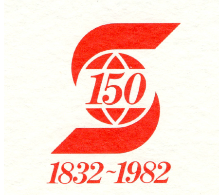
1982
For Scotiabank’s 150th anniversary, a special edition of the logo at the time was created to commemorate the occasion. This version included superimposing the number 150 on the S and added the Bank’s year of establishment and current year underneath.

1987
The logo continued to evolve. The Flying S changed from red to white and was enclosed in a red box, with the word Scotiabank placed either next to it, or underneath. All three variations of this logo were used in Bank materials.

1990
Scotiabank adopts "Banque Scotia" for its marketing name in Quebec. It replaced BNE, short for La Banque de Nouvelle-Ecosse which remains a legal name of the Bank in Quebec. The Bank felt that the new name better conveyed the nature of its business and was inline with the Bank’s corporate logo - a stylized "S" containing the globe.

1998
Eleven years later, the red box around the Flying S was removed and the symbol was moved to the left of the wordmark. Though it might be hard to tell, the font was sharpened slightly to make it more contemporary and distinctive. At this time, the corporate colour, known as Scotia red, was changed from an orange-red to a deeper, more vibrant “true” red.

2019
Scotiabank’s most recent logo was created and the Bank introduced a new design with several new visual elements. Both the Flying S and the Scotiabank wordmark were updated to be more modern, confident, and digital friendly. The globe within the Flying S is replaced with a solid dot. Adopted for small spaces, “Scotia” began to be used in marketing materials for the first time ever.

2022
Scotiabank celebrates its 190th anniversary on March 30, 2022, making it one of the oldest institutions in this country and, in fact, older than the country of Canada itself. A special edition of the Bank’s current logo was created to commemorate the occasion. To learn more about the Bank's evolution over the years, visit the Archives & Corporate History's timeline here.
