- Nonfarm payrolls have fully recovered from the pandemic’s shock…
- ...as job growth smashed expectations again
- Wage growth accelerated as the workforce shrank
- Jobs and hours worked keep piling higher…
- ...but productivity stinks, which often doesn’t end well
- Another 75bps may be delivered at the September FOMC…
- ...but with a lot of other ground to cover by then
- US nonfarm payrolls m/m 000s // UR % // wages m/m %, SA, July
- Actual: 528 / 3.5 / 0.5
- Scotia: 290 / 3.6 / 0.3
- Consensus: 250 / 3.6 / 0.3
- Prior: 398 / 3.6 / 0.4 (revised from 372 / 3.6 / 0.3)
What rudely landed in the laps of market participants this morning was a resoundingly strong jobs report with one or two ongoing flies in the ointment. Jobs and wages say hello to 75bps in September for a data-dependent Fed that is obsessed with looking over its shoulder at the latest prints. Markets reacted by shoving the 2-year Treasury yield about 15bps higher and the 10s yield about 14bps higher while the USD appreciated and so far the S&P 500 is about ¾% lower. September is mostly priced for a 75 move by the Fed.
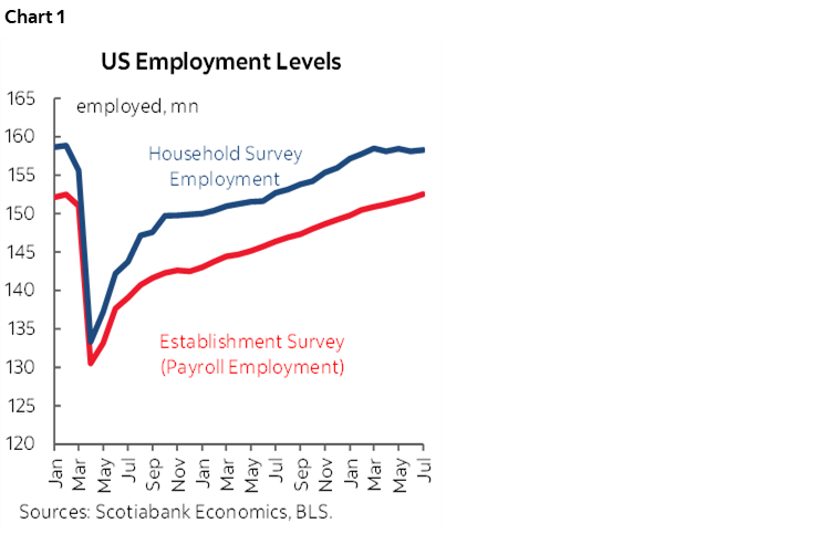
The US is amazingly 32k above the level of nonfarm payrolls from just before the pandemic in what is now a full job market recovery. I'm admittedly surprised by this, but here we are and they have indeed done so. The household survey is only 576k below pre-pandemic levels which for all its wonkiness is at good as even. Both levels of employment have essentially returned the US job counts to where they were (chart 1).
Revisions were minor and only added 28k to the prior two months of jobs estimates with most of that affecting the June estimates.
Wages accelerated. The 0.5% m/m SA rise in July and upward revision to 0.4% m/m SA in June turn in annualized wage gains of 5.8% and 5.4% respectively on a m/m SAAR basis. Wages have been running at this kind of trend pace pretty consistently since about April 2021 (chart 2). Our view remains that real wage growth will turn positive later in the year into next and that in the meantime consumers are bridging the effects of inflation through tapping wealth and liquid cash and near-cash holdings.

Hours worked are tracking a 2.7% q/q SAAR gain in Q3 after gains of about 3½% in each of Q1 and Q2 (chart 3). Hours worked were up by 0.4% m/m SA after a string of 0.3% monthly gains over the prior three months. Since GDP is an identity defined as hours times labour productivity (output per hour worked), the strength in hours worked in isolation of activity readings is much stronger than the GDP numbers suggest. That’s because labour productivity is tanking after a 7.3% q/q SAAR drop in Q1 and probably another ~5% drop in Q2 that we’ll get next week (chart 4). I’m still bothered as an economist by the fact that hours and bodies keep going up while productivity stinks. That often doesn’t end well and so be on guard toward the real possibility that jobs will eventually get hit even if they are currently exceeding expectations.

The labour force participation rate fell again by a tick but it has fallen since the pandemic-era peak in March of this year (chart 5). That’s derived from the household survey that showed the labour force fell by 63k after a prior drop of 353k. The US is having difficulty feeding the beast.

The unemployment rate also fell a tick to 3.5% to tie September 2019 for the lowest unemployment rate since 1969 (chart 6).

Chart 7 shows high breadth to the gain in nonfarm payrolls. The private sector added 471k jobs and is on fire over recent months. Government jobs were also up by 57k and this time led by the state and local governments.

Service sector jobs were up 402k with goods sector jobs up 69k. Within services, the leader were education and health (+122k) followed by leisure/hospitality (96k) and business services (89k with only a 10k assist from temp help).
Chart 8 shows how it is still a somewhat uneven job market recovery at least on a sector basis. Leisure and hospitality industries are still down during the pandemic to date with smaller drops in a couple of other categories, but those workers have been absorbed elsewhere.

Overall, I think numbers like these support the narrative that the Fed is going at least 4-handled on the policy rate and could be there by Q4. They also continue to lean against market pricing for rate cuts next year that have never made sense in my view. A lot more damage has to be incurred in order to credibly stand at chance at licking inflation at least cyclically, though probably not in long wave fashion as I’ll argue in the Global Week Ahead.
DISCLAIMER
This report has been prepared by Scotiabank Economics as a resource for the clients of Scotiabank. Opinions, estimates and projections contained herein are our own as of the date hereof and are subject to change without notice. The information and opinions contained herein have been compiled or arrived at from sources believed reliable but no representation or warranty, express or implied, is made as to their accuracy or completeness. Neither Scotiabank nor any of its officers, directors, partners, employees or affiliates accepts any liability whatsoever for any direct or consequential loss arising from any use of this report or its contents.
These reports are provided to you for informational purposes only. This report is not, and is not constructed as, an offer to sell or solicitation of any offer to buy any financial instrument, nor shall this report be construed as an opinion as to whether you should enter into any swap or trading strategy involving a swap or any other transaction. The information contained in this report is not intended to be, and does not constitute, a recommendation of a swap or trading strategy involving a swap within the meaning of U.S. Commodity Futures Trading Commission Regulation 23.434 and Appendix A thereto. This material is not intended to be individually tailored to your needs or characteristics and should not be viewed as a “call to action” or suggestion that you enter into a swap or trading strategy involving a swap or any other transaction. Scotiabank may engage in transactions in a manner inconsistent with the views discussed this report and may have positions, or be in the process of acquiring or disposing of positions, referred to in this report.
Scotiabank, its affiliates and any of their respective officers, directors and employees may from time to time take positions in currencies, act as managers, co-managers or underwriters of a public offering or act as principals or agents, deal in, own or act as market makers or advisors, brokers or commercial and/or investment bankers in relation to securities or related derivatives. As a result of these actions, Scotiabank may receive remuneration. All Scotiabank products and services are subject to the terms of applicable agreements and local regulations. Officers, directors and employees of Scotiabank and its affiliates may serve as directors of corporations.
Any securities discussed in this report may not be suitable for all investors. Scotiabank recommends that investors independently evaluate any issuer and security discussed in this report, and consult with any advisors they deem necessary prior to making any investment.
This report and all information, opinions and conclusions contained in it are protected by copyright. This information may not be reproduced without the prior express written consent of Scotiabank.
™ Trademark of The Bank of Nova Scotia. Used under license, where applicable.
Scotiabank, together with “Global Banking and Markets”, is a marketing name for the global corporate and investment banking and capital markets businesses of The Bank of Nova Scotia and certain of its affiliates in the countries where they operate, including; Scotiabank Europe plc; Scotiabank (Ireland) Designated Activity Company; Scotiabank Inverlat S.A., Institución de Banca Múltiple, Grupo Financiero Scotiabank Inverlat, Scotia Inverlat Casa de Bolsa, S.A. de C.V., Grupo Financiero Scotiabank Inverlat, Scotia Inverlat Derivados S.A. de C.V. – all members of the Scotiabank group and authorized users of the Scotiabank mark. The Bank of Nova Scotia is incorporated in Canada with limited liability and is authorised and regulated by the Office of the Superintendent of Financial Institutions Canada. The Bank of Nova Scotia is authorized by the UK Prudential Regulation Authority and is subject to regulation by the UK Financial Conduct Authority and limited regulation by the UK Prudential Regulation Authority. Details about the extent of The Bank of Nova Scotia's regulation by the UK Prudential Regulation Authority are available from us on request. Scotiabank Europe plc is authorized by the UK Prudential Regulation Authority and regulated by the UK Financial Conduct Authority and the UK Prudential Regulation Authority.
Scotiabank Inverlat, S.A., Scotia Inverlat Casa de Bolsa, S.A. de C.V, Grupo Financiero Scotiabank Inverlat, and Scotia Inverlat Derivados, S.A. de C.V., are each authorized and regulated by the Mexican financial authorities.
Not all products and services are offered in all jurisdictions. Services described are available in jurisdictions where permitted by law.