- Solid US job growth drove the UR lower
- Wage growth accelerated
- Hours worked are pointing to another solid quarter for GDP growth
- Consumer sentiment spiked higher, inflation expectations lower
- Impressive strengths in household finances offer an explanation for resilience
- None of this says cut as early as markets are pricing
- US nonfarm employment m/m 000s SA / UR %, SA, November:
- Actual: 199 / 3.7
- Scotia: 210 / 3.7
- Consensus: 185 / 3.9
- Prior: 150 / 3.9 (unchanged)
The US economy created about 200,000 jobs last month according to the nonfarm payrolls report while the details were somewhat mixed. The breadth of the payroll gain wasn’t great, but wages accelerated and hours worked continue to point to this being the sixth consecutive quarter in which consensus has been overly pessimistic toward the outlook for the US economy. The companion household survey registered a much bigger gain in jobs that drove the unemployment unexpectedly lower, albeit with less statistical confidence than the payrolls report.
MARKETS & THE FED
Markets didn’t like it so much. The US 2-year Treasury yield jumped 7bps post-data while the 10s yield was up 5bps, thus driving a mild bear flattener. The S&P is gently higher but now slipping somewhat. The dollar strengthened at first but then shook that off when UMIch landed. Fed funds pricing barely budged with markets still pricing about half of a 25bps cut by the March meeting and a full cut by May 1st.
I don’t think this changes much by way of expectations into the FOMC next week. We get US CPI on day 1 of their two-day meeting that starts on Tuesday and I’m expecting a soft reading. My expectation is that the dot plot may show 75bps of cuts next year compared to 50bps the last time and partly influenced by rebasing the starting point that had previously held out the potential for one last hike this year. If so, and if the markets listen to the dots which they did the last time but don’t always, then this could disappoint markets that are on the fence between 100–125bps of cuts next year.
DETAILS — ON BALANCE, THE READINGS WERE STRONG
Soft Breadth to the Job Gain
The breadth of the gain in nonfarm payrolls was not great (chart 1).
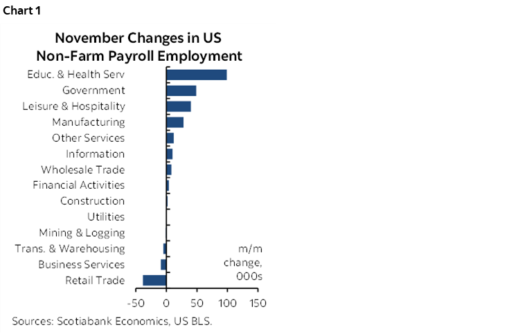
- Health care and social assistance added +93k, and leisure/hospitality was up 40k;
- Government added 49k workers. Private payrolls were up +145k;
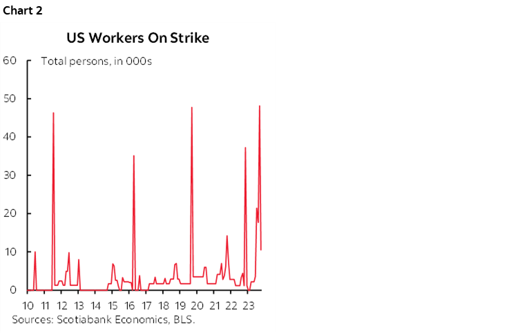
- The end of the UAW strike added back 30k to nonfarm payrolls last month (chart 2).
Services employment was up 121k, while goods sector employment increased by 29k.
The Unemployment Rate Fell
The unemployment rate fell to 3.7% from 3.9% and against consensus expectations for it to be unchanged and some expectations that it would rise (chart 3). The UR is derived from the household survey that recorded a gain of 747k jobs last month versus a 532k increase in the size of the labour force. Ergo, more jobs created than people entering in search of work so the UR fell. The household survey is wildly noisy and more so than nonfarm, however, as the 90% confidence bands around the household survey’s estimated change in unemployment is +/- 300k and for the UR it is +/-0.2 ppts. Still, that works in both directions.
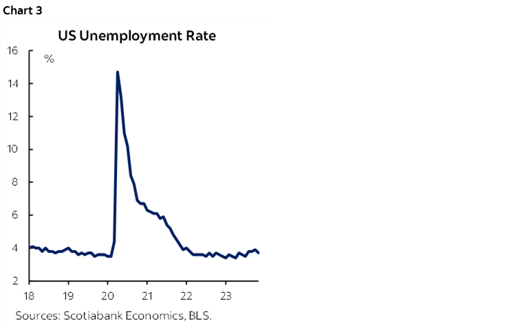
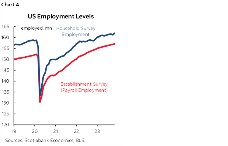
Chart 4 shows that over time the two measures trend together and both point to a sustained period of impressive strength in US employment.
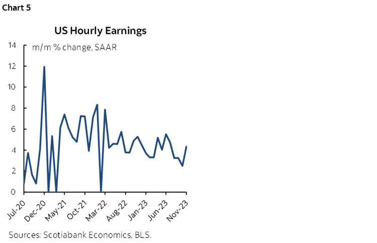
Wage Growth Accelerated
Wages were up by 0.4% m/m SA, or 4.3% m/m SAAR for the hottest reading since July (chart 5). The three month moving average is running at 3.4% m/m SAAR.
Small Revisions
There were mildly negative revisions that subtracted 35k from the prior two months of nonfarm payrolls entirely out of two months ago as the October gain of 150k was left intact.
Hours Worked Were Strong...
Hours worked were up 5% m/m SAAR in November for the biggest gain since January. Hours are tracking about a 1.1% q/q SAAR gain in Q4/Q3 after 1.3% in Q3/Q2 (chart 6).
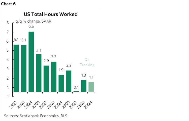
...Which Points to Another Impressive Quarter for GDP Growth
Since GDP is an identity defined as hours worked times labour productivity, this is a solid running head start for further tracking of Q4 GDP growth. If the US can come close to the productivity gains of the prior couple of quarters then GDP growth is shaping up to be materially better than feared. Again.
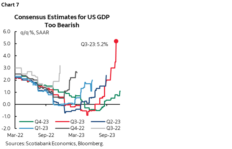
For the sixth straight quarter, doom has been postponed. Chart 7 shows how consensus has been revising Q4 US GDP growth expectations. Up until August, consensus was expecting a contraction in Q4 and ever since then the numbers keep drifting higher. They're still too low so watch for further upward revisions.
Oh, but wait, for sure next quarter right? Or the one after?? Maybe, but there is a strong case that continues to be made for today's differing circumstances particularly as financial conditions ease.
U.S. Households Are in Fine Shape
A major reason is that households have never been in better shape than now (charts 8–11). Debt service is still toward record lows compared to pre-pandemic periods and only mildly off the bottom when loans were being given away in the depths of the pandemic. The household debt:income ratio is at a 22 year low; they learned post-GFC, or were forced to learn by regs. US households have normalized the saving rate (saving flow out of current period incomes) to pre-pandemic norms and even slightly lower, but they have not reduced the mountain of cash sitting on household balance sheets. They've also locked in cheap 30-year mortgages. The effective rate of interest on mortgages in the US is still very low at 3.74%, up only 40bps from the pandemic low and otherwise the lowest in at least modern history back to 1977. In real terms, Americans have been deflating their mortgage debts relative to this effective weighted average cost of borrowing and while the jury is out on future inflation, the real cost of borrowing is likely to be at worst marginally positive.
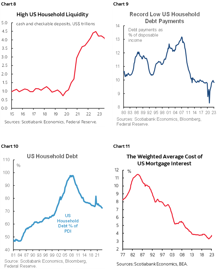
There are lots of forward looking risks and lagging effects of policy tightening but a) this is wy rate sensitivities are lower than feared, and b) measures of financial healthy like these are a great starting point compared to other hike cycles in the past.
That may be why UMich consumer sentiment surprised sharply higher after the jobs numbers. Sentiment increased by 8.1 ppts to 69.4 to just shy of the highest point since the start of last year. Inflation expectations fell 1.4 points to 3.1% over the next year and by 0.4 points to 2.8% over the 5–10 year horizon. That will bolster the FOMC’s argument that expectations are coming down and are reasonably anchored longer term.
DISCLAIMER
This report has been prepared by Scotiabank Economics as a resource for the clients of Scotiabank. Opinions, estimates and projections contained herein are our own as of the date hereof and are subject to change without notice. The information and opinions contained herein have been compiled or arrived at from sources believed reliable but no representation or warranty, express or implied, is made as to their accuracy or completeness. Neither Scotiabank nor any of its officers, directors, partners, employees or affiliates accepts any liability whatsoever for any direct or consequential loss arising from any use of this report or its contents.
These reports are provided to you for informational purposes only. This report is not, and is not constructed as, an offer to sell or solicitation of any offer to buy any financial instrument, nor shall this report be construed as an opinion as to whether you should enter into any swap or trading strategy involving a swap or any other transaction. The information contained in this report is not intended to be, and does not constitute, a recommendation of a swap or trading strategy involving a swap within the meaning of U.S. Commodity Futures Trading Commission Regulation 23.434 and Appendix A thereto. This material is not intended to be individually tailored to your needs or characteristics and should not be viewed as a “call to action” or suggestion that you enter into a swap or trading strategy involving a swap or any other transaction. Scotiabank may engage in transactions in a manner inconsistent with the views discussed this report and may have positions, or be in the process of acquiring or disposing of positions, referred to in this report.
Scotiabank, its affiliates and any of their respective officers, directors and employees may from time to time take positions in currencies, act as managers, co-managers or underwriters of a public offering or act as principals or agents, deal in, own or act as market makers or advisors, brokers or commercial and/or investment bankers in relation to securities or related derivatives. As a result of these actions, Scotiabank may receive remuneration. All Scotiabank products and services are subject to the terms of applicable agreements and local regulations. Officers, directors and employees of Scotiabank and its affiliates may serve as directors of corporations.
Any securities discussed in this report may not be suitable for all investors. Scotiabank recommends that investors independently evaluate any issuer and security discussed in this report, and consult with any advisors they deem necessary prior to making any investment.
This report and all information, opinions and conclusions contained in it are protected by copyright. This information may not be reproduced without the prior express written consent of Scotiabank.
™ Trademark of The Bank of Nova Scotia. Used under license, where applicable.
Scotiabank, together with “Global Banking and Markets”, is a marketing name for the global corporate and investment banking and capital markets businesses of The Bank of Nova Scotia and certain of its affiliates in the countries where they operate, including; Scotiabank Europe plc; Scotiabank (Ireland) Designated Activity Company; Scotiabank Inverlat S.A., Institución de Banca Múltiple, Grupo Financiero Scotiabank Inverlat, Scotia Inverlat Casa de Bolsa, S.A. de C.V., Grupo Financiero Scotiabank Inverlat, Scotia Inverlat Derivados S.A. de C.V. – all members of the Scotiabank group and authorized users of the Scotiabank mark. The Bank of Nova Scotia is incorporated in Canada with limited liability and is authorised and regulated by the Office of the Superintendent of Financial Institutions Canada. The Bank of Nova Scotia is authorized by the UK Prudential Regulation Authority and is subject to regulation by the UK Financial Conduct Authority and limited regulation by the UK Prudential Regulation Authority. Details about the extent of The Bank of Nova Scotia's regulation by the UK Prudential Regulation Authority are available from us on request. Scotiabank Europe plc is authorized by the UK Prudential Regulation Authority and regulated by the UK Financial Conduct Authority and the UK Prudential Regulation Authority.
Scotiabank Inverlat, S.A., Scotia Inverlat Casa de Bolsa, S.A. de C.V, Grupo Financiero Scotiabank Inverlat, and Scotia Inverlat Derivados, S.A. de C.V., are each authorized and regulated by the Mexican financial authorities.
Not all products and services are offered in all jurisdictions. Services described are available in jurisdictions where permitted by law.