- Job growth beat expectations again
- Consensus has underestimated job growth by a whopping 1.7 million since early 2022
- Wage growth super accelerated
- Waiting for the other shoe to drop versus other theories
- US nonfarm payrolls m/m change (000s) / UR (%), April, SA:
- Actual: 253 / 3.4
- Scotia: 220 / 3.5
- Consensus: 185 / 3.6
- Prior: 123 / 3.5 (revised from 189 / 3.5)
Keep wishing for US job growth to disappoint folks. That’s what consensus is doing as it was yet wrong again. The US gained another 253k payroll jobs last month albeit with negative revisions totalling 149k. Still, the US job market continues to defy expectations as waiting for the other shoe to drop keeps getting pushed out instead of possibly entertaining other theories toward what’s happening in the job market. As a result, US Treasury yields spiked, some of the excessive cut pricing got reined in and the S&P is higher as stocks love the resilience more than they dislike the reduced cut bets.
Enter charts 1 and 2. Chart 1 shows that consensus has underestimated growth in the first pass at nonfarm payrolls every single month except for one since the start of last year. Chart 2 shows that after taking revisions into account they’ve blown it 81% of the time!
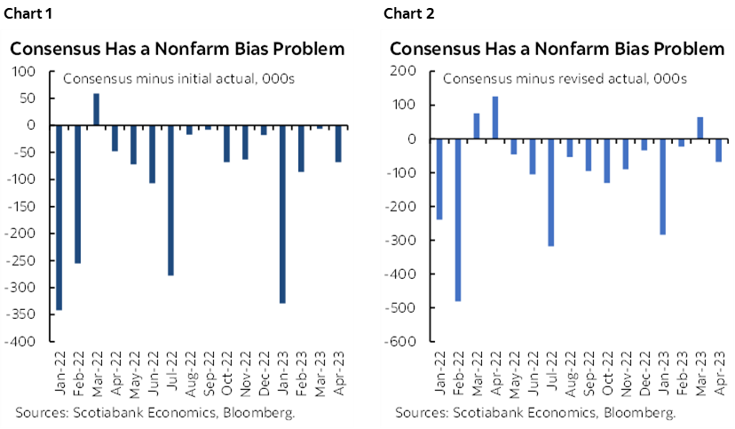
This persistent bias means that consensus has underestimated US payroll gains by a stunning 1.7 million jobs since the start of last year whether we go with initial estimates or the currently revised series. Ah well, consensus says, got it wrong again but just keep pushing it out as the bears have got to come knocking sooner or later.
Maybe. But when we’ve had bond market tightening for over a year-and-a-half and jobs are not even flinching it seems to me that folks need to be at least a little more balanced in their arguments about what’s happening and the possible path forward.
So why else might job growth be serially surprising economists and markets alike? I’ll repeat past suggestions:
- there is ongoing rotation away from sectors that were once hording all of the workers like IT and home delivery services toward all of the sectors that couldn’t hire anyone for a long time like many of the service categories. Layoffs are not high enough to derail this effect this far.
- Different demographics may be driving more hording behaviour today than in past cycles partly in the US where there is basically no population growth;
- the relatively poor productivity of the incremental worker being hired at the margin may also necessitate having to hire more folks to achieve the desired end.
- We’ve never had a tightening cycle coincide with improving supply chains at home and abroad and so this gives the opportunity to produce more;
- That opportunity to produce more needs more inputs when the economy is in excess demand and tight capacity limits. The bias may be more tilted toward labour over capital and hence variable costs over fixed costs amid the uncertainty.
My point is not that I’m the amazing Kreskin and can read the minds of employers and employees alike and can therefore tell you with certainty where this is all headed. But even pointing to the balance that’s missing in the debate is worthwhile information relative to the overly confident markets that are pricing rate cuts this summer and which seems to me to face a higher bar than implied by the actions of the itchy trigger fingers piling into the US front-end.
DETAILS
Chart 3 is a keeper. US wage growth just super accelerated again to the fastest pace (5.9% m/m SAAR) since March of last year.
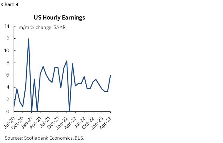
Chart 4 shows that there was decent breadth to the rise in payrolls by sector.
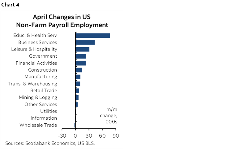
Chart 5 shows that perhaps there is more to come as the leisure/hospitality sector has yet to fully recover, let alone expand employment since before the pandemic.
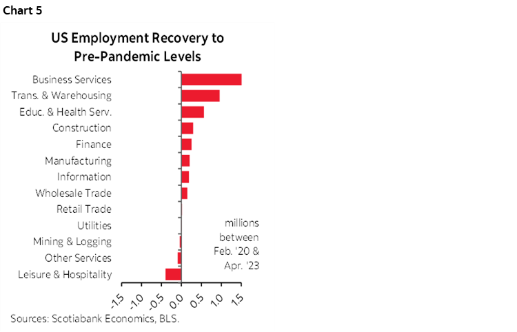
Chart 6 shows that the US unemployment rate fell to 3.4%. It is derived from the companion household survey that shows a smaller job gain of 139k (+577k prior) as the labour force contracted a bit (-43k) after the stunning increases over prior months. The participation rate held steady at 62.6% but is still lower than pre-pandemic levels which continues the debate over whether we’ll ever get back to that level (chart 7).
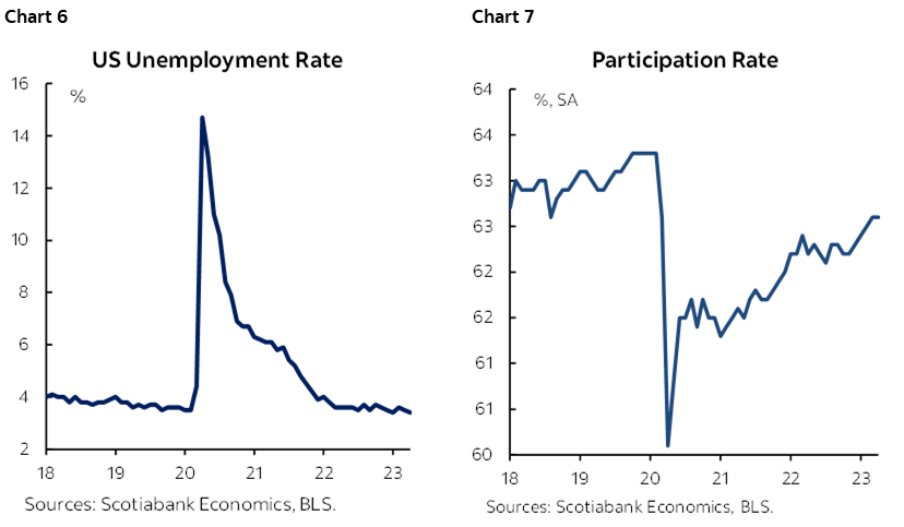
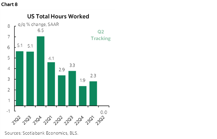
Chart 8 concludes with a negative signal for GDP growth. Hours worked are tracking no gain in Q2 over Q1 so far but with the obvious caution that this is solely based upon April’s reading over the Q1 average and annualized. Since GDP is hours times labour productivity we would have to see either a gain in hours over the rest of the quarter and/or a rise in productivity to keep GDP in the black in Q2. After the drop in productivity during Q1 it may be possible for this to occur. A bit of productivity wouldn’t be a bad thing for once!
DISCLAIMER
This report has been prepared by Scotiabank Economics as a resource for the clients of Scotiabank. Opinions, estimates and projections contained herein are our own as of the date hereof and are subject to change without notice. The information and opinions contained herein have been compiled or arrived at from sources believed reliable but no representation or warranty, express or implied, is made as to their accuracy or completeness. Neither Scotiabank nor any of its officers, directors, partners, employees or affiliates accepts any liability whatsoever for any direct or consequential loss arising from any use of this report or its contents.
These reports are provided to you for informational purposes only. This report is not, and is not constructed as, an offer to sell or solicitation of any offer to buy any financial instrument, nor shall this report be construed as an opinion as to whether you should enter into any swap or trading strategy involving a swap or any other transaction. The information contained in this report is not intended to be, and does not constitute, a recommendation of a swap or trading strategy involving a swap within the meaning of U.S. Commodity Futures Trading Commission Regulation 23.434 and Appendix A thereto. This material is not intended to be individually tailored to your needs or characteristics and should not be viewed as a “call to action” or suggestion that you enter into a swap or trading strategy involving a swap or any other transaction. Scotiabank may engage in transactions in a manner inconsistent with the views discussed this report and may have positions, or be in the process of acquiring or disposing of positions, referred to in this report.
Scotiabank, its affiliates and any of their respective officers, directors and employees may from time to time take positions in currencies, act as managers, co-managers or underwriters of a public offering or act as principals or agents, deal in, own or act as market makers or advisors, brokers or commercial and/or investment bankers in relation to securities or related derivatives. As a result of these actions, Scotiabank may receive remuneration. All Scotiabank products and services are subject to the terms of applicable agreements and local regulations. Officers, directors and employees of Scotiabank and its affiliates may serve as directors of corporations.
Any securities discussed in this report may not be suitable for all investors. Scotiabank recommends that investors independently evaluate any issuer and security discussed in this report, and consult with any advisors they deem necessary prior to making any investment.
This report and all information, opinions and conclusions contained in it are protected by copyright. This information may not be reproduced without the prior express written consent of Scotiabank.
™ Trademark of The Bank of Nova Scotia. Used under license, where applicable.
Scotiabank, together with “Global Banking and Markets”, is a marketing name for the global corporate and investment banking and capital markets businesses of The Bank of Nova Scotia and certain of its affiliates in the countries where they operate, including; Scotiabank Europe plc; Scotiabank (Ireland) Designated Activity Company; Scotiabank Inverlat S.A., Institución de Banca Múltiple, Grupo Financiero Scotiabank Inverlat, Scotia Inverlat Casa de Bolsa, S.A. de C.V., Grupo Financiero Scotiabank Inverlat, Scotia Inverlat Derivados S.A. de C.V. – all members of the Scotiabank group and authorized users of the Scotiabank mark. The Bank of Nova Scotia is incorporated in Canada with limited liability and is authorised and regulated by the Office of the Superintendent of Financial Institutions Canada. The Bank of Nova Scotia is authorized by the UK Prudential Regulation Authority and is subject to regulation by the UK Financial Conduct Authority and limited regulation by the UK Prudential Regulation Authority. Details about the extent of The Bank of Nova Scotia's regulation by the UK Prudential Regulation Authority are available from us on request. Scotiabank Europe plc is authorized by the UK Prudential Regulation Authority and regulated by the UK Financial Conduct Authority and the UK Prudential Regulation Authority.
Scotiabank Inverlat, S.A., Scotia Inverlat Casa de Bolsa, S.A. de C.V, Grupo Financiero Scotiabank Inverlat, and Scotia Inverlat Derivados, S.A. de C.V., are each authorized and regulated by the Mexican financial authorities.
Not all products and services are offered in all jurisdictions. Services described are available in jurisdictions where permitted by law.