- Core CPI at 0.16% m/m was the softest in almost three years
- Core services inflation tumbled
- Breadth improved, underlying details were supportive
- Core PCE could be very soft at month-end
- This is the first soft print after a string of hot ones…
- ...raising the risk that markets are overreacting….
- ….ahead of Chair Powell’s cautious optimism
- Canadian rates followed suit, 5s may be getting pricey
- US CPI / core CPI, m/m % SA, May:
- Actual: 0.0 / 0.16
- Scotia: 0.2 / 0.3
- Consensus: 0.1 / 0.3
- Prior: 0.3 / 0.3
- US CPI / core CPI, y/y %, May:
- Actual: 3.3 / 3.4
- Scotia: 3.5 / 3.5
- Consensus: 3.4 / 3.5
- Prior: 3.4 / 3.6
This is a great report! But settle down folks, it’s just one print. It’s an encouraging one, but the evidence bar for the Federal Reserve to be cutting any time soon is set much higher than a single inflation print.
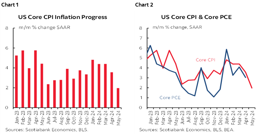
Nevertheless, core CPI inflation landed at 0.16% m/m SA for the softest reading since August 2021. Underlying details were even better as they showcased very soft core services inflation that now joins soft core goods inflation, alongside further improvement in the breadth of price changes.
Chart 1 shows the drop in annualized core CPI. Chart 2 serves as a reminder of translation risk into core PCE later this month. Core PCE could be quite soft given its lower weight on shelter and higher weight on core services inflation that appears to have imploded. It’s feasible that on June 28th we’ll get the first one-handled core PCE m/m SAAR reading in about six months or even lower. Core PCE puts a lower weight on shelter that was still firm in CPI, and a higher weight on core services inflation that apparently tanked last month.
VIOLENT POSITIONING SWING
Markets reacted with a violent positioning swing that brought the US 2-year yield down 13bps to 4.69% which is getting back down to levels last seen in early April before a two-month rates sell off ensued. The US 5s yield fell similarly to 4.26% and is arguably still cheap. The dollar immediately depreciated including on a DXY basis, against almost all major and semi-major crosses, and including a half-cent appreciation in the C$ relative to the USD.
Still, bear in mind that for the most part the US 2-year yield has only taken out the jump that occurred after last Friday’s nonfarm payrolls report. On net, the yield is about 5–6bps lower than it was before nonfarm with this morning’s reaction.
Fed funds futures are now pricing about 21bps of a cut by September which is consistent with our call for a first quarter-point reduction at that meeting. July 31st FOMC cut pricing only marginally increased but is still a rounding error, albeit that the door cannot be slammed on that meeting with one more CPI and two more PCE reports due by then. Markets are pricing a little over 50bps of easing this year which is also our call.
Canada’s curve followed suit with a 12bps rally on the day in 2s and 5s. In my opinion, Canada 5s are starting to look a little pricey whereas US 5s arguably remain cheap in absolute terms and relative to Canada.
THE FOMC WILL REQUIRE MUCH MORE EVIDENCE
Still, it’s a single print. Core CPI at 2.0% m/m SAAR in May follows six months of three- and four-handled readings.
I wouldn’t expect Chair Powell to come out doing waist high leg kicks and pirouettes on this one print during his presser this afternoon. He’ll sound encouraged and retain the cautious optimism he had in his last presser, but say they don’t yet have the required ‘greater’ confidence toward achieving dual mandate goals to begin easing.
Much of their slowing growth and rebalancing narrative remains only partly achieved and requires further evidence to take the economy away from excess demand as a driver of inflation toward balance.
DETAILS
Chart 3 shows that the bottom fell out of core services inflation last month. At 0% m/m SA, CPI services less energy and housing was the softest reading since September 2021.
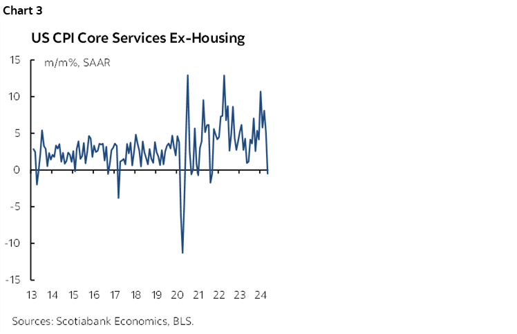
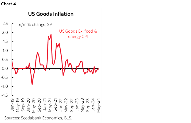
Chart 4 shows that this development joined still soft core goods inflation.
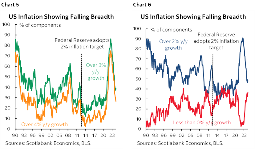
Breadth also continues to improve (charts 5, 6).
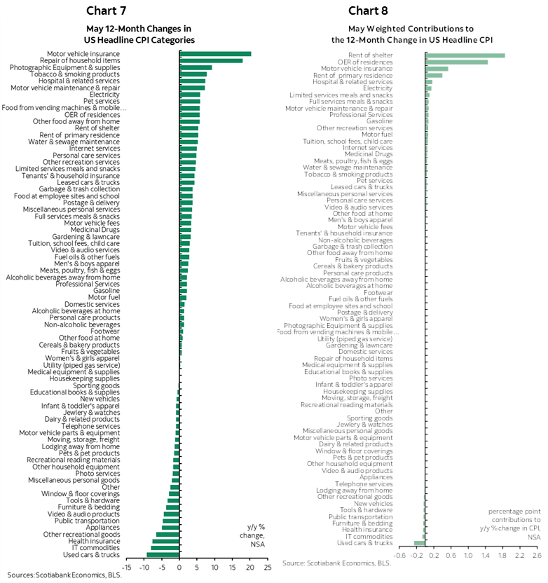
Charts 7 and 8 show the breakdown of the CPI basket in y/y terms and weighted contributions to the headline y/y inflation rate respectively.
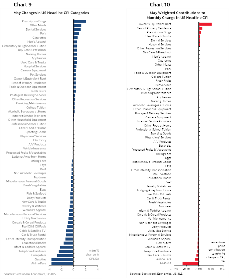
Charts 9 and 10 do likewise for the month-over-month changes in the basket’s prices.
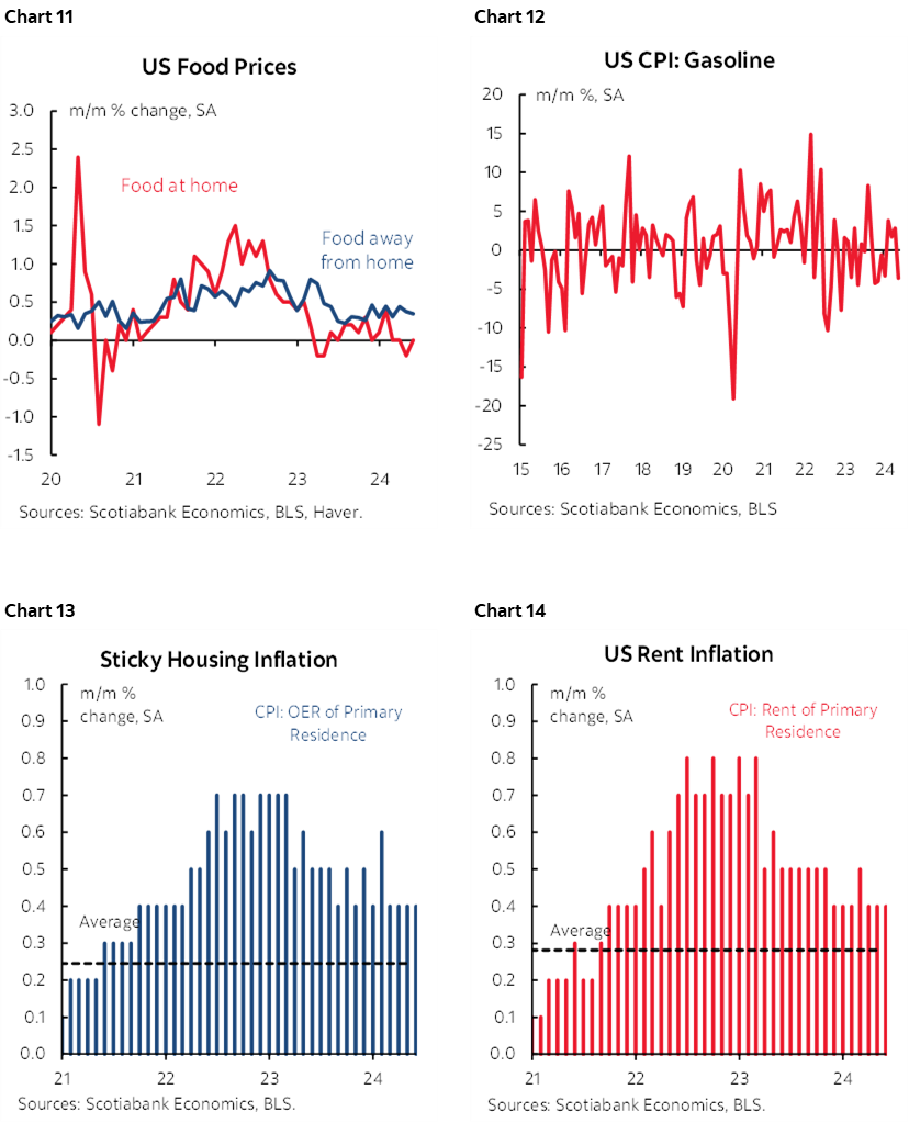
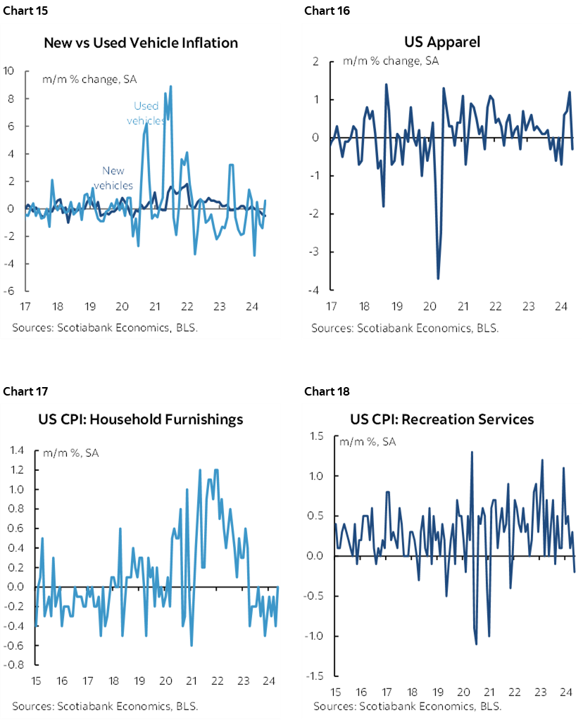
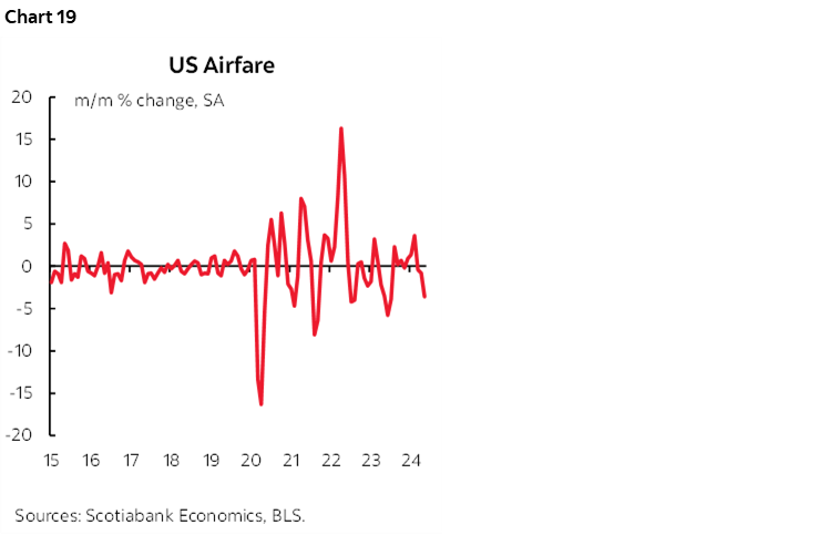
Charts 11–19 offer further charts across select components.
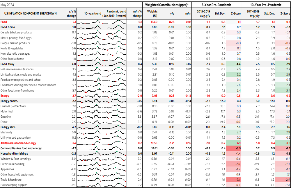
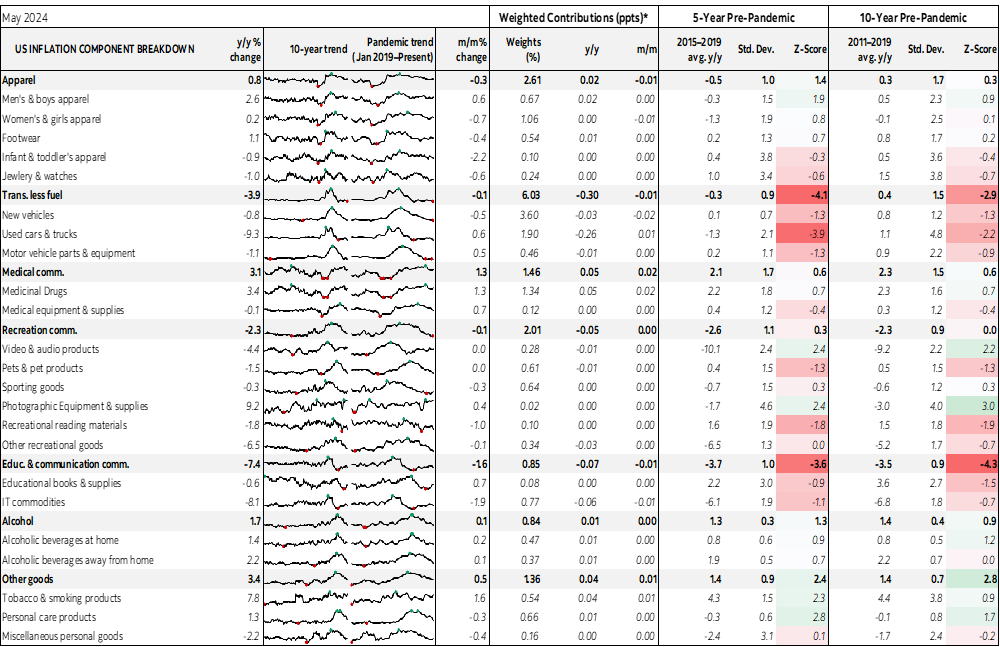
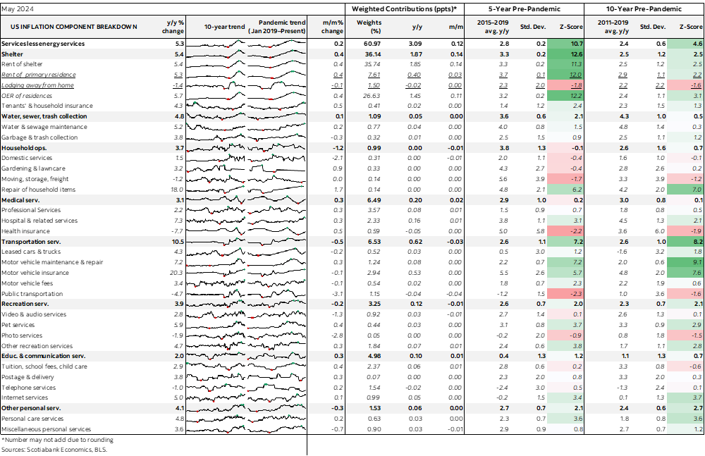
The appendix provides a fuller break down of the report with micro charts and z-score measures of deviations from recent performance.
DISCLAIMER
This report has been prepared by Scotiabank Economics as a resource for the clients of Scotiabank. Opinions, estimates and projections contained herein are our own as of the date hereof and are subject to change without notice. The information and opinions contained herein have been compiled or arrived at from sources believed reliable but no representation or warranty, express or implied, is made as to their accuracy or completeness. Neither Scotiabank nor any of its officers, directors, partners, employees or affiliates accepts any liability whatsoever for any direct or consequential loss arising from any use of this report or its contents.
These reports are provided to you for informational purposes only. This report is not, and is not constructed as, an offer to sell or solicitation of any offer to buy any financial instrument, nor shall this report be construed as an opinion as to whether you should enter into any swap or trading strategy involving a swap or any other transaction. The information contained in this report is not intended to be, and does not constitute, a recommendation of a swap or trading strategy involving a swap within the meaning of U.S. Commodity Futures Trading Commission Regulation 23.434 and Appendix A thereto. This material is not intended to be individually tailored to your needs or characteristics and should not be viewed as a “call to action” or suggestion that you enter into a swap or trading strategy involving a swap or any other transaction. Scotiabank may engage in transactions in a manner inconsistent with the views discussed this report and may have positions, or be in the process of acquiring or disposing of positions, referred to in this report.
Scotiabank, its affiliates and any of their respective officers, directors and employees may from time to time take positions in currencies, act as managers, co-managers or underwriters of a public offering or act as principals or agents, deal in, own or act as market makers or advisors, brokers or commercial and/or investment bankers in relation to securities or related derivatives. As a result of these actions, Scotiabank may receive remuneration. All Scotiabank products and services are subject to the terms of applicable agreements and local regulations. Officers, directors and employees of Scotiabank and its affiliates may serve as directors of corporations.
Any securities discussed in this report may not be suitable for all investors. Scotiabank recommends that investors independently evaluate any issuer and security discussed in this report, and consult with any advisors they deem necessary prior to making any investment.
This report and all information, opinions and conclusions contained in it are protected by copyright. This information may not be reproduced without the prior express written consent of Scotiabank.
™ Trademark of The Bank of Nova Scotia. Used under license, where applicable.
Scotiabank, together with “Global Banking and Markets”, is a marketing name for the global corporate and investment banking and capital markets businesses of The Bank of Nova Scotia and certain of its affiliates in the countries where they operate, including; Scotiabank Europe plc; Scotiabank (Ireland) Designated Activity Company; Scotiabank Inverlat S.A., Institución de Banca Múltiple, Grupo Financiero Scotiabank Inverlat, Scotia Inverlat Casa de Bolsa, S.A. de C.V., Grupo Financiero Scotiabank Inverlat, Scotia Inverlat Derivados S.A. de C.V. – all members of the Scotiabank group and authorized users of the Scotiabank mark. The Bank of Nova Scotia is incorporated in Canada with limited liability and is authorised and regulated by the Office of the Superintendent of Financial Institutions Canada. The Bank of Nova Scotia is authorized by the UK Prudential Regulation Authority and is subject to regulation by the UK Financial Conduct Authority and limited regulation by the UK Prudential Regulation Authority. Details about the extent of The Bank of Nova Scotia's regulation by the UK Prudential Regulation Authority are available from us on request. Scotiabank Europe plc is authorized by the UK Prudential Regulation Authority and regulated by the UK Financial Conduct Authority and the UK Prudential Regulation Authority.
Scotiabank Inverlat, S.A., Scotia Inverlat Casa de Bolsa, S.A. de C.V, Grupo Financiero Scotiabank Inverlat, and Scotia Inverlat Derivados, S.A. de C.V., are each authorized and regulated by the Mexican financial authorities.
Not all products and services are offered in all jurisdictions. Services described are available in jurisdictions where permitted by law.